
Why Academic Papers?
Within this two years, I’ve been reading hundred of academic papers and conference journals for research projects and my ongoing thesis. I am also interested about typography and believe that it can change the preception of the readers. Good typefaces and typography arrangment can bring better readiability and impression to the readers. However, most of the academic papers is polluted with overused font and snoring typography schemes. In this article, I would like to make a comparison of how better typography can change the overall quality of the document appearence and style.
Academic Paper Formats
There are various style manual for the researchers and wrtier to follow. Generally, these style guides include information about margin, line height, structure of the content, citation style and so on. If you are not familiar with these styles, please see the follwing guide about popular style guides:
For post-graduate students and researchers affiliated with a particular institution, they have to follow the standard the organization used. For independent researchers, it depends on the style starndard of the research paper publishers. From my experience, most of the academic papers are worse, except papers from Elsevier. You can even say it terrible. Why? Bear with me and let’s take a look at some sample academic papers from different publishers.
The following is the quotation of the first paragraph from A Writing Handbook.
The Modern Language Association (MLA) provides explicit, specific recommendations for the margins and spacing of academic papers. (For details on MLA’s typography guidelines, see: Document Format.) But the MLA Handbook’s advice on font selection is less precise: “Always choose an easily readable typeface (e.g. Times New Roman) in which the regular style contrasts clearly with the italic, and set it to a standard size (e.g. 12 point)” (§4.2).
It can be seen that you have a choice over selecting reasonble typefaces, rather than typewriter fonts and typewriter layouts. Let’s take a look at some academic papers.
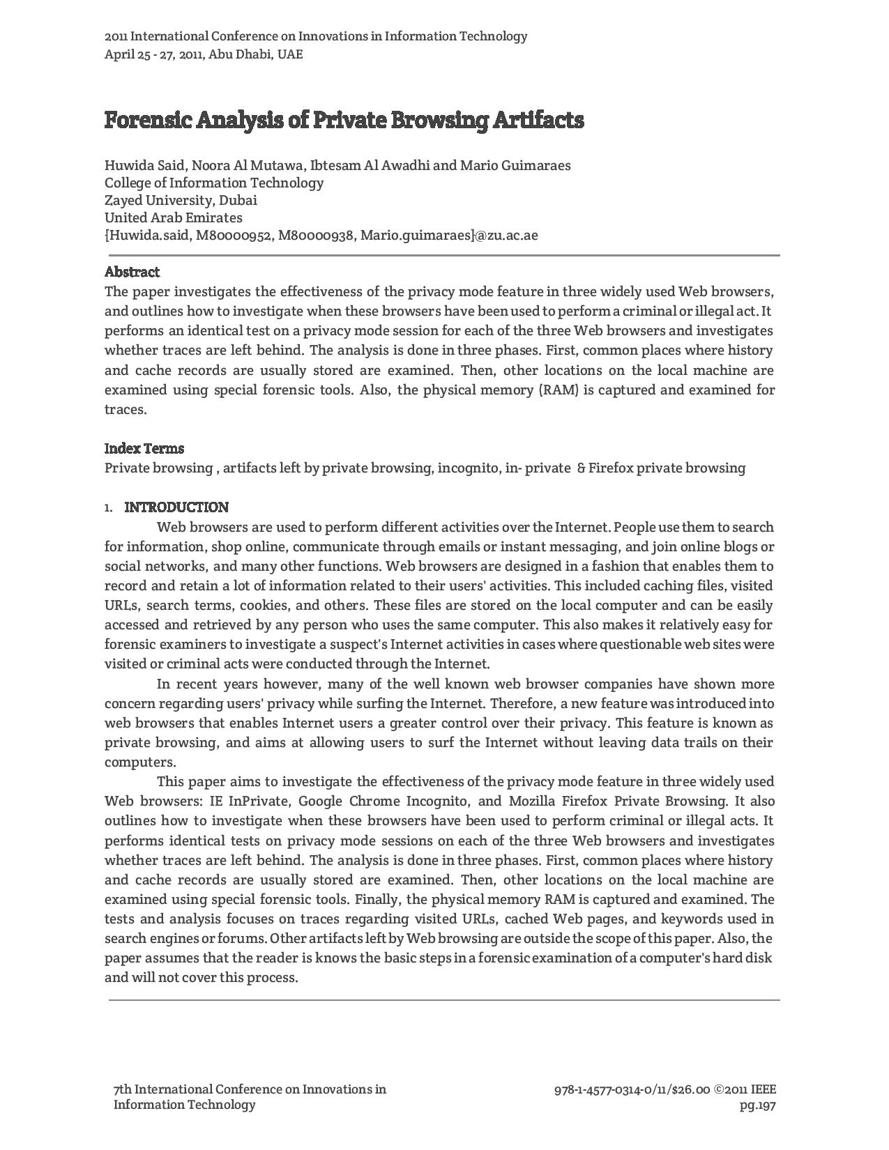
The following two papers is from 2 different publishers. It’s quite obvious to make a decison between these two papers about which one possess better typography.The first paper is from Elsevier and the second paper is from IEEE. Differences between these two papers are
- line height of header text should be aligned center vertically.
- Contents of both are justified but one with hypenation and another is not.
- Font Quality(Elsevier uses Gulliver and IEEE uses Times New Roman )
- Spacing between Number and Section header
- Abstract section is lost emphasis in IEEE paper.
- Footer and Footnote difference. Elsevier uses footnote for author contact and copyright information. IEEE mess eveything up about article information.
- IEEE has unnecessary huge lane between two columns.
- Generally, the layout of Elsevier paper is working better than IEEE.
At the next section, I will do some experimental layout with several typefaces to see the improvements of IEEE paper and also the process of creating these documents.
Elsevier Journal Paper format 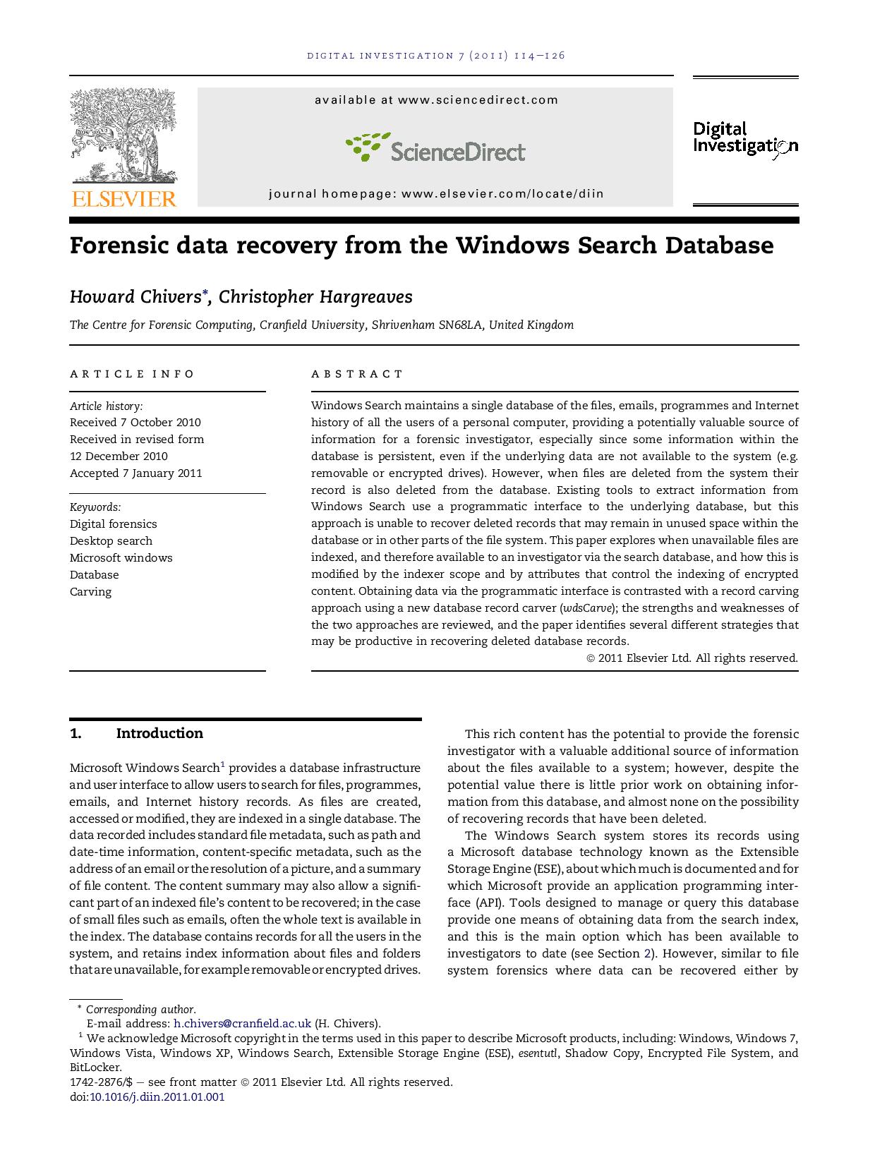
IEEE Journal paper format 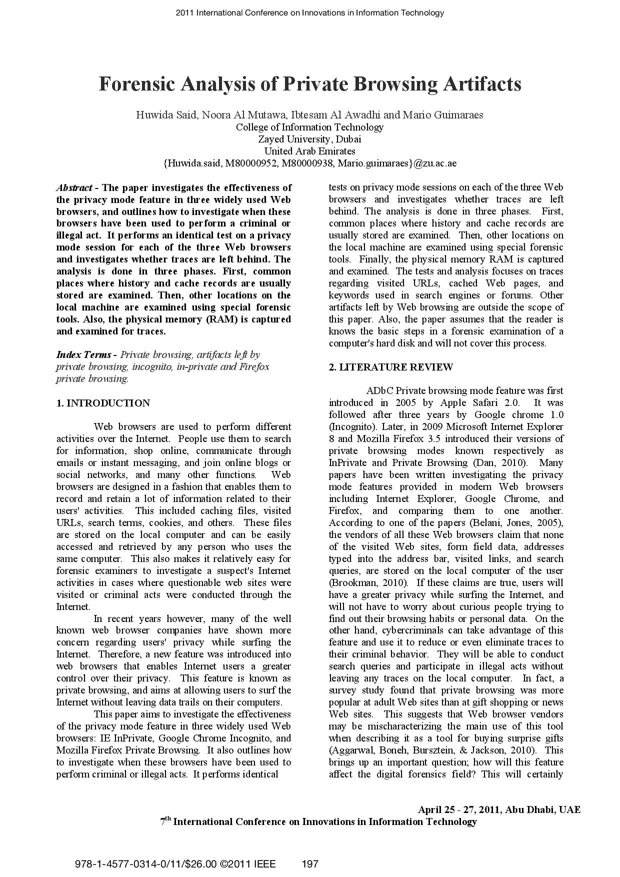
How can it be improved?
Firstly, The following proposed formats don’t follow any document standards. Just my imagination and knowledge… You can decide on it’s working or not. The process of creating these documents are
- select a proper layout (3 differnt layouts)
- select a single serif font (seif font family is recommened font type for academic papers.)
- Arrange the information into similar groups
- Use my own common sense
Ok. Let’s take a look at 3 different documents on the same content.The common settings among these document is that margin is 1 inch, line-height is also 1,font size for conetent is 10 and font size for title is 16. Font size for header and footer is 9 points. Instead of paragraph indentation, try a blank line to create a whitespace.
One thing to understand is that I created these documents with Google Doc and there is no feature to turn on auto hypentation. You can find how to turn on hypentation forproprietary word processors.
Font Face: EB Garamond
It seems to be working quite well. The header and footer is getting orgranized with similar information and humanist typeface make the paper elegant.
Font Face: Merriweather
The fontface is not created for printing media but it’s suprisingly working well. It’s more easier to read, compared with previous document but the tradeoffs is that fewer words cover in the first page. Also,notice that font size 10 of Merriweather looks bigger than EB Garamond.
Font Face: Crete Round
Slab serif is not a good fontface for block of texts. It’s better to use for texts within table instead of courier. The layout is not the common one used by academic papers.
Font Recommendations
Dr. Mark Womack said…
I usually ask my students to use Century Schoolbook or Palatino for their papers. If your teacher requires you to submit your papers in a particular font, do so. (Unless they require you to use Arial, in which case drop the class.)
A good serif font with proper size (10-12 points) according to the layout. 2 column layout needs smaller size than one column.
Be all papers have better typography…
To conclude, I belive that all publishers should exercise a good typography scheme like Elsiver do.